Ugly Colors
Ugly, unflattering, draining, or just plain boring — these are the words people use most often when they fill out my questionnaire as part of their virtual color analysis. I ask about their best colors, but also their worst. And certain colors come up again and again.
What counts as an "ugly color" is subjective, of course. But after years of doing this, some clear patterns have emerged. Below, I walk through the top colors most commonly cited as unflattering, and explain why none of them are actually ugly when worn by the right person.
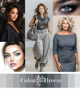
What got me thinking about this topic was a post I created, below, for social media about the color grey, specifically, how it doesn't get nearly enough credit.
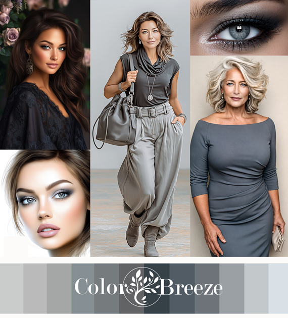
That post got a great response, which made me want to dig deeper into other underappreciated colors, especially the ones people are most quick to write off.
Everyone who understands color analysis knows that there really aren’t any intrinsically ‘ugly colors’. Yes, some colors are psychologically more uplifting, fun, and "pretty" than others.
But whether a color is unflattering on you depends, of course, on your coloring.
Let’s start with the number one most cited ugly color on my list:
Top Ugly Color: Mustard
Mustard is probably the most commonly cited "ugly color" I hear, and I understand why. On the wrong person, it can look flat, dated, and just plain off.
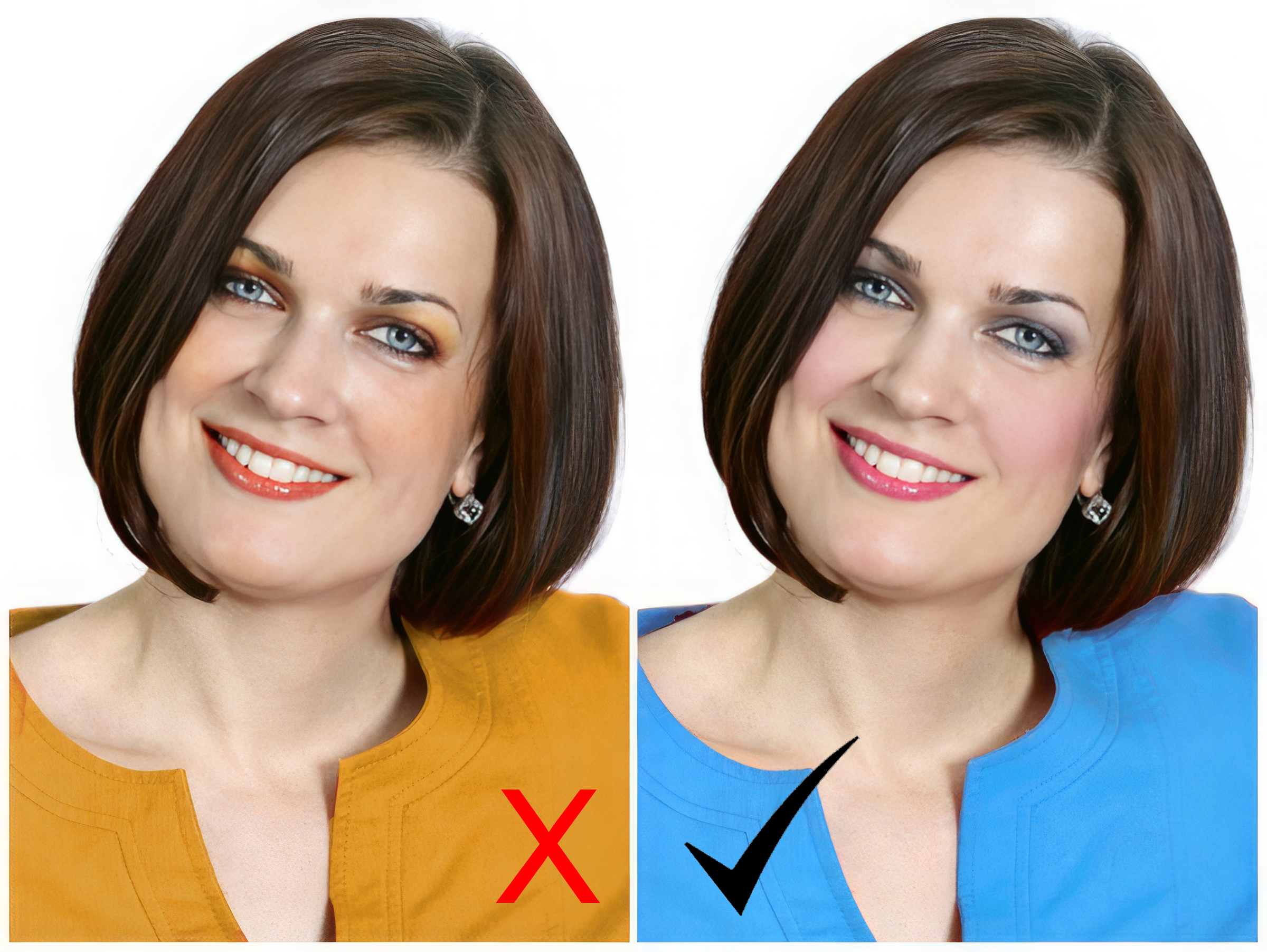
Wrong color vs right color for a Winter season.
For cool seasons like Winters and Summers, it's too warm, too earthy, and too muted all at once. It clashes with cool, clear, or delicate skin tones rather than working with them.
But for Autumns? Mustard works well.
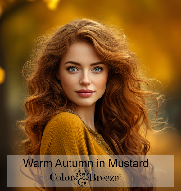
True, deep mustard is particularly strong on Warm Autumns. It's rich and earthy in exactly the way their warm, golden coloring calls for.
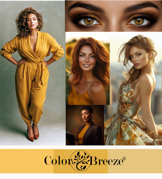
Lighter, softer versions of mustard, ones that start to drift toward honey or amber, are a better fit for Soft Autumns, whose coloring is more muted and gentle.
For other autumn sub-types, mustard can work in small doses as an accent, like a scarf, a bag, or a piece of jewelry, without overwhelming the face.
Bottom line: mustard is a color that harmonizes wonderfully with richness and warmth.
Next Ugly Color: Beige
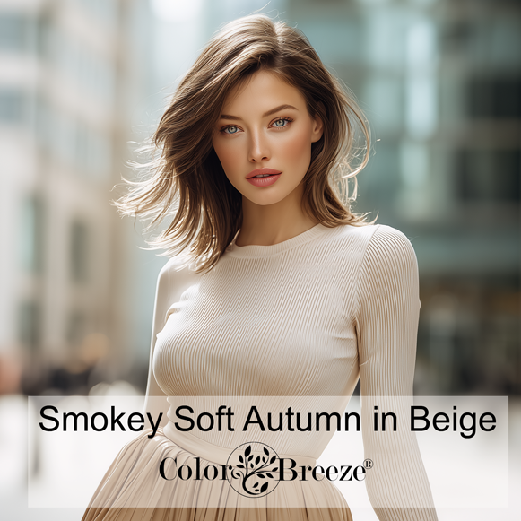
Beige comes up often in my questionnaire responses as a color people feel washes them out or makes them look tired.
The feedback comes most often from Winters, especially Deep Winters.
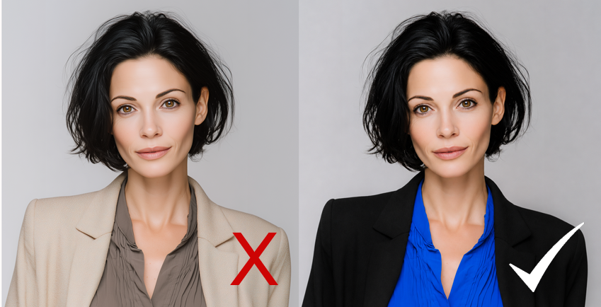
All Winters need strong depth and contrast to look their best. On Deep Winters in particular, the color beige can be genuinely draining.
But beige isn't one thing. It's more of an umbrella term — a range of light, sandy neutrals that blend white with soft undertones of yellow and brown. Think unbleached wool or pale desert sand.
But depending on the lighting and the specific undertone, beige can read quite differently.
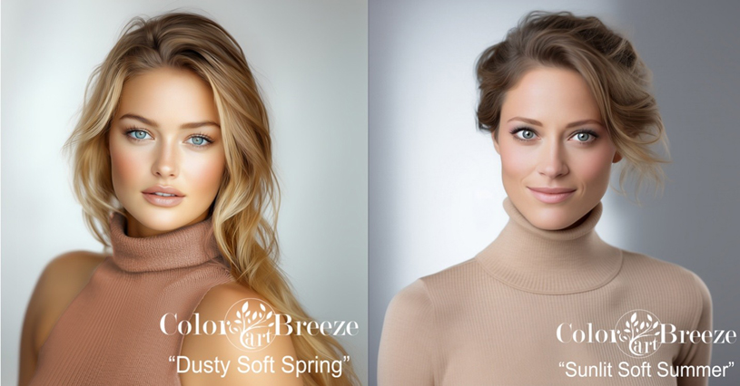
On the warm side, it reads as a soft, creamy tan or light brown. But when it picks up grayer undertones, it crosses over into what people call "greige" (gray-beige) or taupe territory.
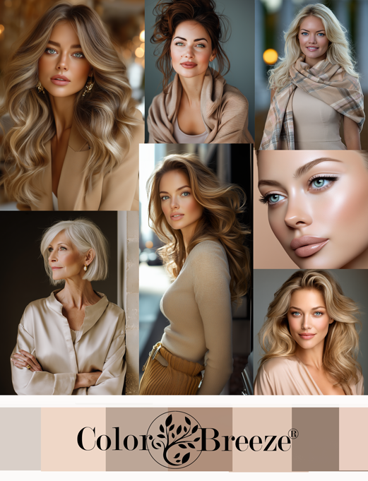
Warmer shades of beige are particularly good on soft Autumns. Lighter, sandy shades are great neutrals for Spring.
The cooler shades of beige or taupe are best on Summers and Winters.
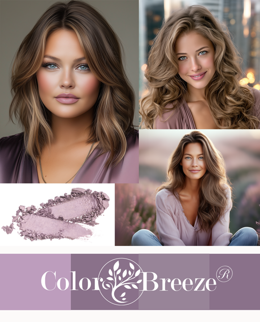
Next Ugly Color: Mauve
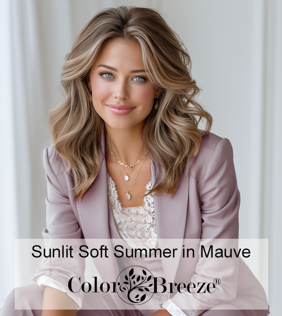
Mauve, especially dusty, muted mauve, rounds out the top three most-cited unflattering colors in my color analysis practice.
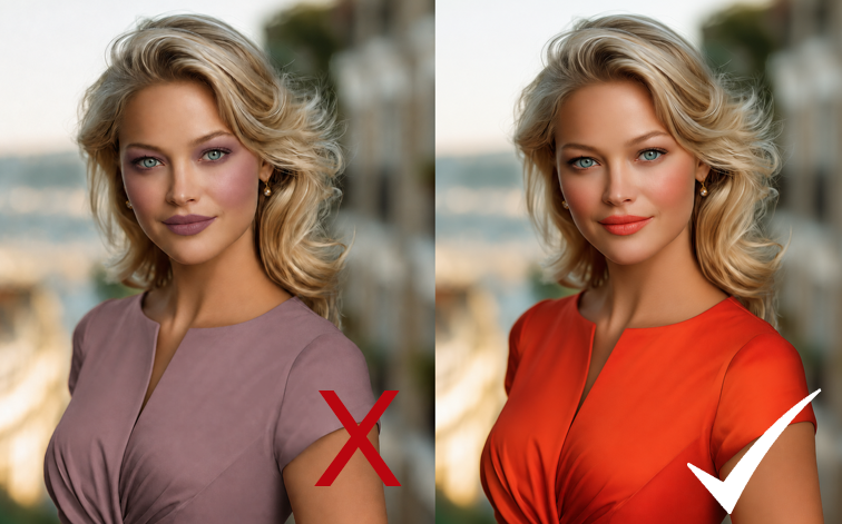
For seasons that need warmth and brightness, like Springs, dusty mauve can look flat and lifeless.
Dusty mauve is flat and dull, as if it is tamping down Springs' shine.
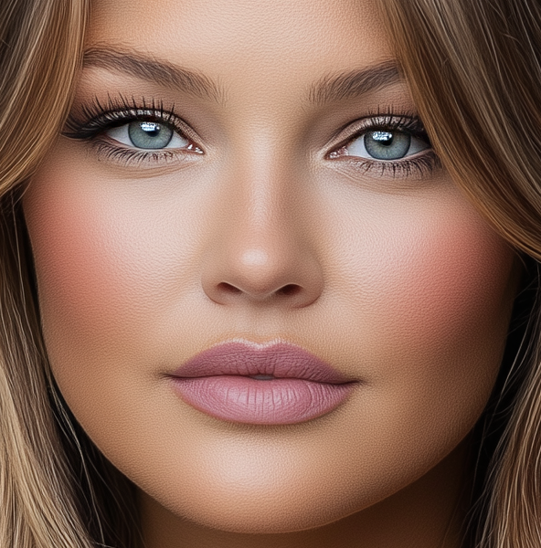
But Soft Summers, whether lighter or deeper, cooler or slightly warmed, can handle that tamped-down quality because their own coloring has a similar softness to it.
Many Soft Summers naturally have a faint mauve-like blush in their cheeks and lips. Wearing mauve near the face and in makeup simply amplifies what's already there.
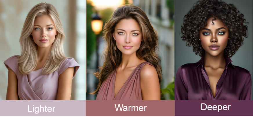
Lighter shades of mauve are especially lovely on Light Summers and Dusty Soft Summers. Slightly warmed-up mauve shades extend into Soft Autumn territory, particularly for blended-temperature types like Dusty Soft Autumns. And cooler, deeper versions — rich plums and berries — work well on deeper Soft Summers and Soft Winters.
What if you love a color that isn't in your palette?
This comes up all the time. You don't have to completely give up a color just because it's not ideal for your season.
If you love a color that's not in your palette, here are a few tips to help make it work:
- Use it as an accent. Wear it in smaller doses, like a bag, shoes, a belt, jewelry, or other accessories, where it won't have a major impact on your face.
- Keep it out of the hot zone. The closer a color is to your face (the décolletage and above), the more impact it has, for better or worse. The further away it is, the less it matters.
- Layer it under something that works. A jacket or scarf in one of your best colors can neutralize the effect of a less-than-ideal shade underneath.
As much as I am about finding one's exact season, and determining the absolute best colors for each season, realize that Color analysis is a tool, not a strict "written-in-stone" set of rules. Once you understand the reasoning behind your palette, you get much better at knowing when and how to bend them.
Return to Home page
SHOP

Recent Articles


-
Find a ColorBreeze® Certified Consultant | Color Allure
Aug 03, 26 03:55 PM
 Meet our certified ColorBreeze® consultants — professional color analysts trained and licensed in the full 28-season system to help you find your colors
 -
Micro Color Analysis goes a little deeper than just naming a season.
Jun 19, 26 11:09 AM
 Micro color analysis is a term I'm using for when I give a small explanation for why I chose the season I did for certain ai art images.
 -
Ugly Colors — Which Ones Are Actually Flattering (and on Whom
May 31, 26 12:48 PM
 Ugly colors like beige, mustard, and mauve aren't always unflattering — it depends on your season. Find out which "ugly" colors might actually work for you



CONTACT
www.ColorAllure.com
Lora Alexander
lora@colorallure.com
779.770.4716

LEARN MORE
TRAINING
Learn the ColorBreeze™ System
(accepting new enrollments)
© Copyright 2008-2026 - ColorAllure. Privacy Policy