Cool Earth Tones
Not all earth tones are warm
I recently had a client whom I analyzed as a Sunlit Soft Summer.
She was appreciative of my analysis, but she did say that she prefers wearing ‘earth tones’, and some of the Sunlit Summer palette colors might be too flashy for her.
I explained that this season actually does embrace earth tones—just not the heavy, warm versions we usually think of first.
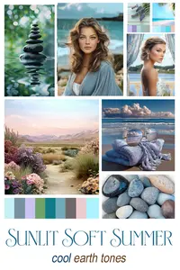
Sunlit Soft Summer earth tones are quieter, cool earth tones. More neutral. More weathered. Less brown soil and golden olive…more stone, sand, driftwood, and sea glass.
That conversation stayed with me, and it’s what inspired this small mood board below to visually express how I see the Sunlit Soft Summer palette as it relates to its natural environment.

In general, I view the 4 main seasons how they are related to nature: earth and sky.
I see Springs and Winters as sky: Clear, light-filled, and pure. Springs carry warmth through sunlight, while Winter is cooler and more crystalline, like the ice crystals forming from water vapor high in the air.
I see Summers and Autumns, by contrast, as grounded. They belong to the earth. Their colors are softer, denser, and more muted.
We usually associate earth tones with warmth—brown soil, golden fields, deep olives, and rusts from fallen leaves. And that’s true, especially for Autumn.
But earth tones don’t have to be warm.
They can also be cool and quiet: smooth river stones, pale sand, weathered bark, misty hills, the blue and turquoise of the ocean. Think pebbles instead of clay, and coastal paths instead of forest floors.
For someone drawn to earth tones but sensitive to the heaviness or warmth, this season can feel like a cool, gentle breeze. It offers grounding without weight and nature without too much warmth.
Anyway, this is how I see the Sunlit Soft Summer ~
SHOP
Recent Articles
-
More testimonials from satisfied clients | Color Allure
Feb 18, 26 10:37 AM
 Read more testimonials from my clients who were happy with their color analysis. All my analyses are done by me, not an ai app.
 -
Micro Color Analysis goes a little deeper than just naming a season.
Feb 14, 26 02:47 PM
 Micro color analysis is a term I'm using for when I give a small explanation for why I chose the season I did for certain ai art images.
 -
Cool Earth Tones - not all earth tones are warm | Color Allure
Feb 08, 26 06:15 PM
 Cool earth tones include stone, pebble, cool ocean blues. See my mood board of some cool earth tones of the Sunlit Soft Summer.

CONTACT
www.ColorAllure.com
Lora Alexander
lora@colorallure.com
779.770.4716
LEARN MORE
TRAINING
Learn the ColorBreeze™ System
(accepting new enrollments)
© Copyright 2008-2026 - ColorAllure. Privacy Policy